daily ui design challenge
Over the summer, I wanted to improve my design skills, so I started doing the daily UI design challenge. Every day there was a new design challenge and I gave myself an hour or so to ideate and come up with a final design. This was an exercise in getting me to think from scratch, be creative, and try new styles. Below are some of my favorite designs.
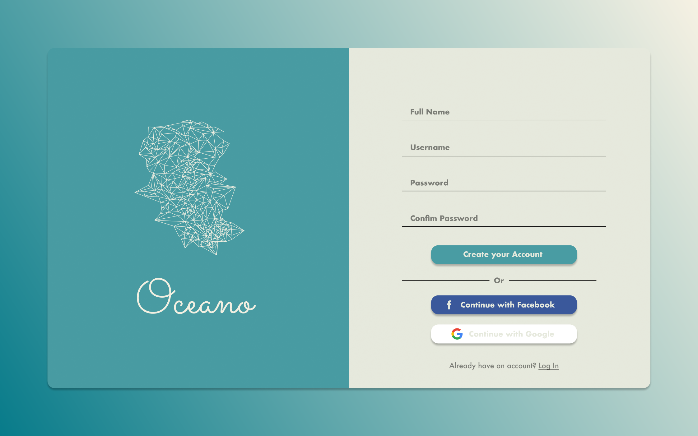
day 1: sign-up

This was one of the first designs I made, and my main goal was to just tinker with different styles and see how things fit together. I wanted my sign-up page to be intuitive to use and as minimal as possible.
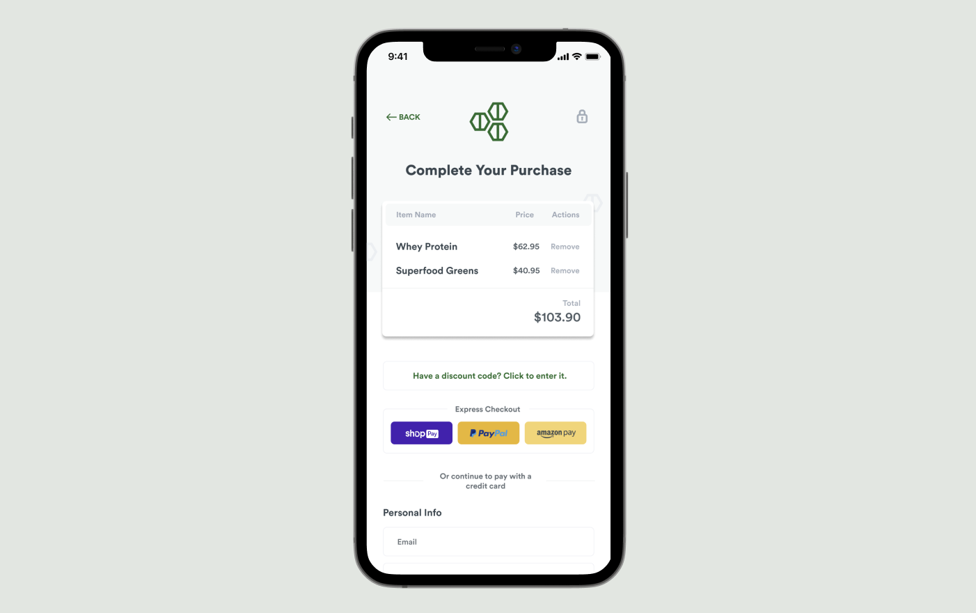
day 2: checkout screen

When designing a checkout screen, I wanted to make sure that the different parts of the checkout prooccess don’t feel disjointed. Each section is clearly demarcated with a box or line (items, discount code, checkout via alt service, regular checkout), yet it still flows intuitively to the next thing.
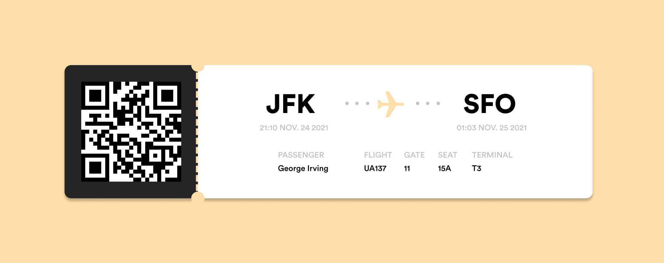
day 24: boarding pass

Boarding passes have always been hard to read and figure out what you need. I wanted to design something that was both easy to use and pleasing to look at. I started the redesign by figuring out what important information was necessary to have: flight information, name, seat, gate, and time. I tried laying out the information in a way that was still familiar but more clear.
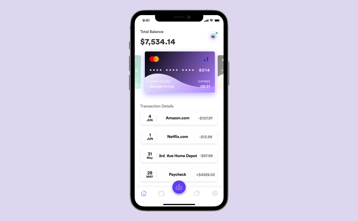
day 129: e-wallet

The focus of this design was just creating a clean wallet app that wasn’t too cluttered and provided the most important information only.
